You’ve spent weeks perfecting your new logo design. On your MacBook Pro or your iPhone, it looks sharp, modern, and vibrant. But then, the day arrives: you pick up your newly branded van, and something is wrong.
The colours look “muddy,” the text is hard to read from a distance, or worse — the edges of the logo look jagged and blurry, as if they were made of Lego bricks.
What happened? The truth is that design for the physical world requires a completely different technical approach than design for the digital world. Here are the three most common reasons why logos fail the “van test.”
The Raster vs. Vector Trap
This is the single biggest cause of “blurry logo syndrome.” Most business owners are used to seeing Raster files (like JPEGs or PNGs). These are made up of a fixed number of pixels. When you try to stretch a small PNG to fit the side of a Ford Transit, the computer has to “guess” where to put new pixels, resulting in a blurry, pixelated mess.
Professional designers use Vector files (EPS or PDF). Vectors aren’t made of pixels; they are made of mathematical paths. You can scale a vector logo to the size of a skyscraper or a postage stamp, and it will remain pin-sharp every single time.
Colour Profiles: RGB vs. CMYK
Screens and printers “speak” different languages.
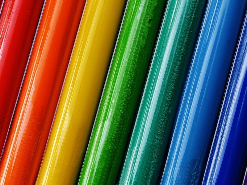
- RGB (Red, Green, Blue): This is how your screen creates colour using light. It can produce incredibly bright, neon, and saturated tones.
- CMYK (Cyan, Magenta, Yellow, Black): This is how a printer creates colour using physical ink.
Many “budget” or DIY logos are designed in RGB. When that file is sent to a vehicle wrapper, the printer has to convert those “light-based” colours into “ink-based” colours. Often, those vibrant blues become dull navies, and bright greens become forest greens. A professional brand strategy includes specific CMYK or Pantone codes to ensure your van looks exactly like your website.
The “Distance Legibility” Factor
A logo that looks great when you are sitting 12 inches away from a screen might fail when a potential customer sees it from 30 feet away in traffic.
- Thin Fonts: Elegant, thin fonts disappear at a distance or when the van is moving.
- Intricate Detail: Complex illustrations become “visual noise” when viewed from afar.
- Low Contrast: If your text colour is too similar to the van’s paint colour, it won’t “pop.”
Professional vehicle branding requires a high-contrast, bold approach that prioritizes legibility at 60mph just as much as aesthetic beauty.
Summary
Your van is a moving billboard. If the branding is poor, it tells potential customers that your standards might be low. If the branding is sharp, professional, and clear, it builds instant trust before you’ve even stepped out of the driver’s seat.
Build a Brand That Performs Everywhere
Don’t let a technical error undermine your professional reputation. At Autumn Studios, our graphic designers provide a comprehensive Master File Suite with every project, ensuring your branding is technically perfect for everything from a high-resolution retina screen to a full-scale vehicle wrap.
We specialize in human-led, bespoke design that ensures your business looks like the industry leader it is.
We offer logo design services in Norwich, Dereham, Ipswich, Thetford and more.
Ready to get started? Let’s build something together.