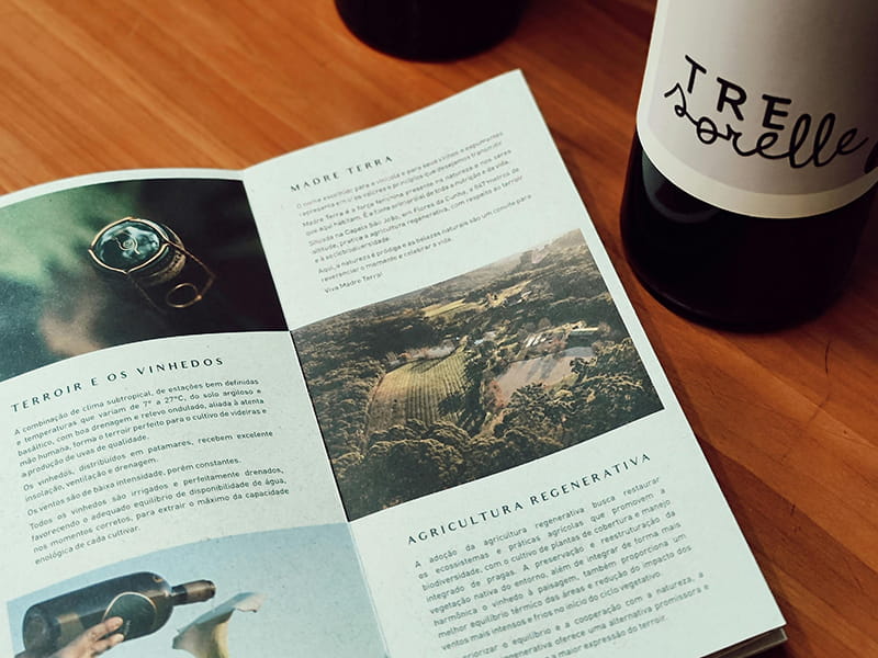
In the world of branding, we often talk about color psychology and imagery, but there is a silent ambassador that arguably works even harder: typography. If your logo is the “face” of your business, your choice of font is its “tone of voice.”
Most business owners choose fonts based on what “looks nice,” but professional typography is a strategic tool. It’s the difference between looking like a fleeting trend and looking like an established authority. Here is a breakdown of what your font choice is actually telling your customers about your professionalism.
The Psychology of Serif vs. Sans Serif
The most fundamental choice in typography is between Serif and Sans Serif. Serifs are the small decorative “feet” at the ends of character strokes. Traditionally, Serif fonts (like Times New Roman or Baskerville) communicate reliability, heritage, and authority. They suggest a business that is grounded and trustworthy.
On the flip side, Sans Serif fonts (like Helvetica or Montserrat) are clean, modern, and efficient. They communicate innovation, transparency, and approachability. If you are a Graphic Designer working with a tech startup, you’ll likely lean toward a Sans Serif to project “future-forward” energy. If you’re a law firm, a Serif is often non-negotiable for projecting stability.
Legibility: The Ultimate Mark of Professionalism
You might find a beautiful, ornate script font that looks “classy,” but if your customers can’t read your phone number or your services list in three seconds, the design has failed. Professionalism is rooted in functionality.
High-end typography considers “kerning” (the space between letters) and “leading” (the space between lines). When these are handled by an expert Logo Designer, the result is effortless readability. Amateur design often feels “claustrophobic” because the text is too tight, or “disjointed” because the spacing is inconsistent. Clear, spacious typography tells your audience that you are organized and easy to do business with.
Visual Hierarchy and Guiding the Eye
Professional typography isn’t just about picking one font; it’s about how you pair them to create a hierarchy. Your eye should naturally hit the H1 (the most important message) first, followed by subheaders, then body copy.
When everything is the same size, or when you use too many different fonts (the “ransom note” effect), the brain becomes overstimulated and checks out. A professional brand identity usually sticks to two—at most three—font families. This restraint signals discipline and sophistication. It shows that you have a clear message and you know exactly how to deliver it.
The Cliché Trap: Avoiding “Personality” Overload
We’ve all seen the “fun” fonts—Comic Sans, Papyrus, or overly literal “handwritten” scripts. While they might feel like they add personality, they often strip away a brand’s perceived value. In a professional context, “personality” should be subtle. It should be found in the weight of the stroke or the unique curve of a “g,” not in a font that tries to tell a joke.
A professional font doesn’t scream for attention; it commands it through balance and precision. It tells your clients that you pay attention to the details—and if you pay that much attention to your typography, you’ll likely pay that much attention to the service you provide them.
Conclusion: An Investment in Your Voice
Typography is an investment in how your business “sounds” on paper and on screen. Whether you are aiming for the academic prestige of a heritage brand or the sleek minimalism of a modern boutique, your font is the delivery vehicle for your message. Don’t let a “default” font choice undermine your expertise. Choose a typeface that speaks as professionally as you do.